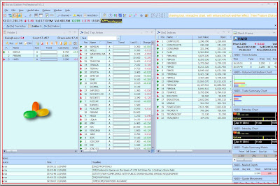
Today I decided to test Bursa Station ability to provide me with information from an investor perspective.
And since I had been chatting a lot on every one's favourite 'investor', bullbear, from FusionInvestor chatbox, I decided to make this a posting with dual purpose: A review of HaiO and A Review of Bursa Station.
First I add Hai-O into my Stock list.
With the cursor clicked on HaiO, I made a right click. A new window pops up and I chose Financials.
My immediate attention was where I drew the arrow. See how it states as 2008 Q3 and the previous quarter indicated 2007 Q2. An error?
So I decided to look at my other feeds.
The above was from RHB and the bottom was from Kenwealth, who uses KLSE tracker software.
And it would appear that everyone is following what's published from HaiO on Bursa website. Quarterly rpt on consolidated results for the financial period ended 31/1/2008 - indicated 2008 Q3 while Quarterly rpt on consolidated results for the financial period ended 31/10/2007 - indicated 2007 Q2. But since Hai-O had already reported its FY 2007 earnings, the quarterly earnings reported by Hai-O in Dec and Sept were wrongly labeled. ( I would not fault Bursa Station here)
Moving on, I scroll down the financial pop-up from Bursa Station on Hai-O.
Neat. The first line indicated a drastic increase of the number of shares and checking Bursa Malaysia website, this increase was caused by a 1:5 bonus issue back in Aug 2007. And as explained by Bursa Station the figures shown are extracted directly from company announcements without any adjustments.However, as an user, if Bursa Station was to be my one and main financial portal that has everything, then perhaps Bursa Station should come out with a better layout and design that provides the user better flow of information. Remember, as it is, I had only looked at 2 pages, and already I had to make clicks to other websites for better understanding of what's happening here.
Next, I noticed there is no indication of the total cash and total borrowings. Not sufficient! This would mean that I would have to dig out the information myself.
On another note, as an investor, note the investments line on HaiO's balance sheet.
The next page is I see when I scrolled down is the cash flow.
And then at the end is the financial ratios below.
Comments on the EPS line.
Yeah, so many ways to interpret EPS, makes you wonder why folks use PE as a main criteria
Anyway, as it is now, HaiO has some 82 million shares. Last year few years, it had only around 68 million shares. So what Bursa Station is doing here is it calculated all the previous years earnings per share based on a share base of 82 million shares. Yes, it's an adjusted eps figure. Some might like this setting but some might not.
Actually I find it lacking but for many, these information on Bursa Station should probably be enough.
And while right clicking on the stock quote on Bursa Station, I discovered that Bursa Stations offers tick charts!
Two windows opens up. One empty window and one the tick charts. (I am puzzled at the empty window!)
Of course, the main issue here is why a different charting within Bursa Station?
Anyway, it looks messy.
The lower two windows draws the ROC and MACD. I do not like it and I removed both of them via the drop down boxes on the top left. I then took out the Moving Averages too by clicking on the small SMA boxes.
A much cleaner look yes?
The colors of the candles and all of their indicators can be adjusted.
The min ticks offered are the 1, 2, 3, 4, 5, 10, 15, 10, 30 and 60.
So with this tick charts, all my early grouses on Bursa Station were answered except for price adjustment. For example, the below chart shows HaiO on a one year time frame. And the massive gap down in the chart on Sept 2007 is caused by the bonus issue. Again, perhaps Bursa Station should offer the option of having an adjusted price chart and a non-adjusted price chart.


3 comments:
Due to the unadjusted price chart that presented on BursaStation, After dividend/bonus issue of a stock, BursaStation will be showing higher moving average compare to adjusted price chart.
Moving average is a significant indicator to decide our target prices, should we follow the adjusted or unadjusted price?
Woah! This is a very old posting.
About ur question, I would think that adjusted share price is more useful. Why? Because one cannot buy the unadjusted share pricing anymore. So it would be more meaningful to use an adjusted share price.
I just sent an email to ask BursaStation regarding the unadjusted price chart. This is what they reply..
Dear Sir,
Kindly be informed that our historical chart data are adjusted for special dividend, rights, bonuses, consolidation and split from ex date going backward; normal dividend is not adjusted.
Normal dividends are given out on a regular basis by the companies and hence these are “expected” and factored into the share price. As soon as a share goes “ex” on this dividend, it theoretically becomes “cum” the next dividend. So, notionally there is a build up of value in the share price as it moves toward the next dividend, then drops to zero on the "ex" date, before starting to build up again.
A special case is special dividends, which are once-off dividends given by the company and hence not “expected” and factored into the share price. We will adjust for it.
Thank you and good day.
Regards,
Bursa Station Team
Post a Comment